Thready App Redesign

 
P5Mockup.jpg


Project Overview

Thready is a native mobile app designed for collecting and organizing conversations with threads. Users can create threads within conversations to revisit and keep track of the things they talk about and share. It’s key to share this app with friends and have a wider network so everything can be organized in one place. The more people you have to share it with the better it works.

During our sprint, the app was in beta testing, with the goal to launch by the end of 2018.


Role: UX/UI Designer

Duration: 2.5 week sprint

Tools: Google Forms, Pen and Paper, Whiteboard, Sketch App, Photoshop, Zeplin, Invision, Google Slides, Google Docs


noun_Project_1991896.png

Our Design Goals

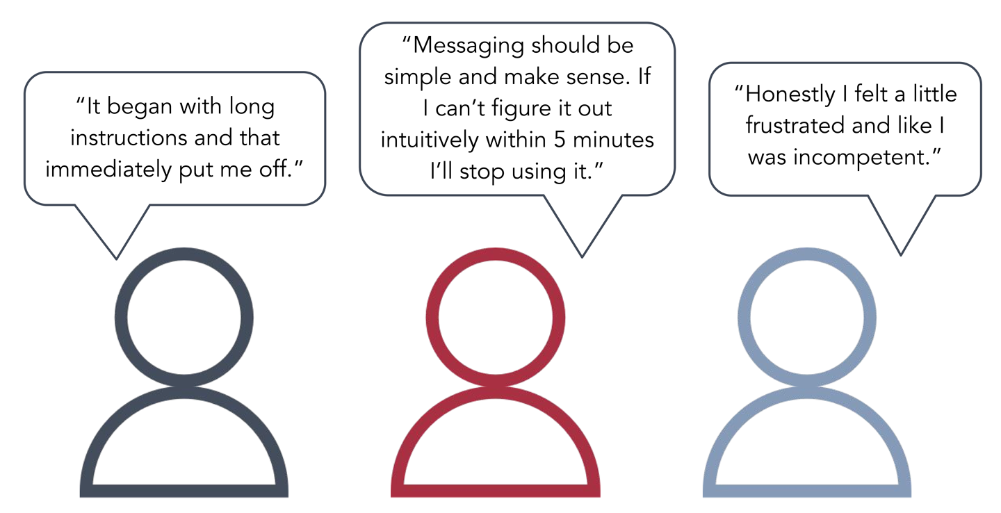
The client asked us to review the usability of the application and increase the number of sign-ups. We decided to focus on reviewing and optimizing the main user flow.

Our goal as designers was to help optimize the app for the launch; to make it appealing and functional to both current and new users.


Discovery Through Research

P5Banner.png


Getting To Know The App

We started our initial research with a heuristic analysis of the beta prototype to identify potential issues with the app, such as:

  • The tutorial loaded as multiple messages and all at once, which could be overwhelming for the user.

  • There were inconsistencies with “+” icon. In this example, the “+” sign on the homepage brought you to a contacts page with the ability to invite friends. On other screens it allowed the user to create a chat or thread.

  • There was no global search function

P5Heuristics.gif
 

Researching Best Practices

Our competitive & comparative analysis compared key features with other messaging apps. Our research revealed that while all of the apps we looked at have group messaging, only a few, like Slack, Whatsapp and Thready, offer users the ability to create threads.

And while Thready does offer a limited contact search function, it’s the only app in our research to not include a full content search, allowing users to search the entire app by keyword to locate specific information.

P5C&C.png
 

Who Are Our Users?

Our two surveys received a combined 62 responses and found some important key findings for our demographic and messaging preferences. For usability test selection, our key indicators required that they be an iPhone user, a frequent texter, and have some familiarity with threads.

P5Survey.png
  • 58.2% were between age 25-34

  • 78.2% are working professionals

  • 41.8% find value in chat threads

  • 41.6% prefer to spend 1-5 min to learn a new app

  • 49.1% would like the ability to organize their texts


Testing The App

With the key indicators in mind, we were able to identify 6 candidates for testing and started with our first round of usability tests for the current beta prototype build and recognized some problem areas within the flow:

  • Overwhelming tutorial- users were shocked and visibly distressed trying to skim or read through the tutorial.

  • Difficult to navigate- users had trouble going back to other pages as it was a linear path of going back and forth in the app.

  • Unfamiliar icons- many users had trouble with the messaging options you see on the screen and could not distinguish what some options meant. The send button looked like an Airbnb icon and camera button looked like an Instagram icon.

P5Message2.png
 

What Did They Think?

We conducted some post-test interviews with our subjects. Many of their complaints were centered around frustration with the tutorial.

 
P5InterviewSlide.png
 
 
Thinking_Icon.jpg

The Problem

Our research helped us to formulate a problem statement:

Messaging app users would like to have the ability to organize their conversations but are reluctant to try a new system if it isn’t quick and easy to learn.

How might we help these users to efficiently adapt to a new thread messaging app?


 Definition & Synthesis

P5Banner.png


Illustrating The User’s Experience

We created our persona, Victoria, based on the demographics, needs and goals of our interview and test subjects.

 
P5_Persona.png


Victoria’s journey map takes her through the process of using Thready from on-boarding to thread creation. Like our test subjects, she’s thrown off by the tutorial. She tries to read it but finds it difficult to remember once she leaves that screen. Ultimately, she’s able to figure out how to use Thready, but the process is frustrating and takes some trial and error.


Visualizing Our Data

We created an affinity map to find themes and patterns from our interviews, surveys and tests.

Our Insights:

P5AffinityMap2.jpg
  • Users felt overwhelmed by the tutorial, and that it was ultimately unhelpful

  • The thread creation process was confusing and frustrating

  • Users found the navigation to be inconsistent and “disjointed”

  • Many found the idea of threads intriguing, but were not inclined to use the app in its current iteration

 
Synthesis_Icon.png

Synthesis

Upon encountering the tutorial, users’ immediate reaction was that the app must be complicated and difficult to learn to require so much information. It created a negative expectation that colored their experience.

We hypothesized that, if we were to significantly improve the consistency of the navigation and UI of the app, the tutorial would be entirely unnecessary.


Feature Prioritization

We used the Moscow method to identify the primary features that would be essential for the redesign, as well as other features common to messaging apps.

 
P5FP2.png
 

Proposed Sitemap

We created a new sitemap for Thready with a global navigation, so users can move more easily between the apps primary screens.

 
P5 Site Map.png


Proposed User Flow

Then we developed our user flow to address the main touchpoints they would encounter.

Proposed User Flow.png
 

 Design & Iteration

P5Banner.png


Testing Our Ideas

Our initial paper prototypes were based on those lo-fi sketches and included 10 main screens with some modals and other elements we’d add as needed throughout the flow.

We added the footer navigation bar to give the user global access to the app, as well to indicate their location.

We tested 6 users total, and after each test we iterated to tweak the design.


Lo-to-Medium Fidelity Wireframes

After a solid round of paper prototype testing and iteration, we were ready to move to low to medium fidelity in Sketch.

From our observations we felt that many of our users’ issues might be related to the test’s fidelity level.


Further Testing & Iteration

Screen Shot 2019-01-17 at 1.10.01 PM.png

Further testing reinforced known issues and uncovered new ones. The original app used both the thready icon and a hashtag to denote thread functions. Users were confused by the inconsistency, so for our redesign, we decided to use only hashtags.

However, more testing revealed that users didn’t connect hashtags with threads. We brought back the logo and added a brief tutorial message to prep people on its function.

 
P5Footer.png

Then one of our users pointed out a major flaw in our new footer navigation. We’d added a Thready icon to give users clear access to their threads, but as threads are specific to individual chats that access wouldn’t make sense in a global nav. So we removed it and focused on overall improvement in the hope of negating its need.


After exhaustive testing and iteration, we concluded that some form of a tutorial was necessary to help guide users through the less familiar features of the app. We settled on contextual messages that would greet users on their first visit to a screen, and then disappear when they navigate out.

 
Chat_Page_1.png
Friends_Page_2.png


Thready’s original threads list screen (on the left) included only the most recently used threads, as well as a search bar limited to searching threads. To give users more options, we created tabs they could used to filter their threads (shown on the right).

 
Thread_List_1.png
Thread_List.gif


Prototype

 
P5Banner.png


Our Solution

Our clickable high-fidelity prototype takes our first-time user, Victoria, through the process of:

  • Inviting her friends to join the app with an easy selection, invitation and confirmation process that doesn’t require her to leave the app.

  • Creating a group chat with her friends, and giving it an avatar and name.

  • Creating a thread for their puppy photos, and moving the photos they’ve already sent to the Puppies thread.

    Please click anywhere on the phone below to view the prototype in action.


Conclusion

With our improvements, we were able to cut down on both the number of steps in our flow and the time to complete it. We also added more consistency throughout the app. All of these improvements should translate to new users sticking around to learn and enjoy Thready.


P5NextSteps.png